Lee Jameson:
A colorful, bodacious brand identity.
SERVICES PROVIDED
Brand strategy
Visual identity
Copywriting
Website Design
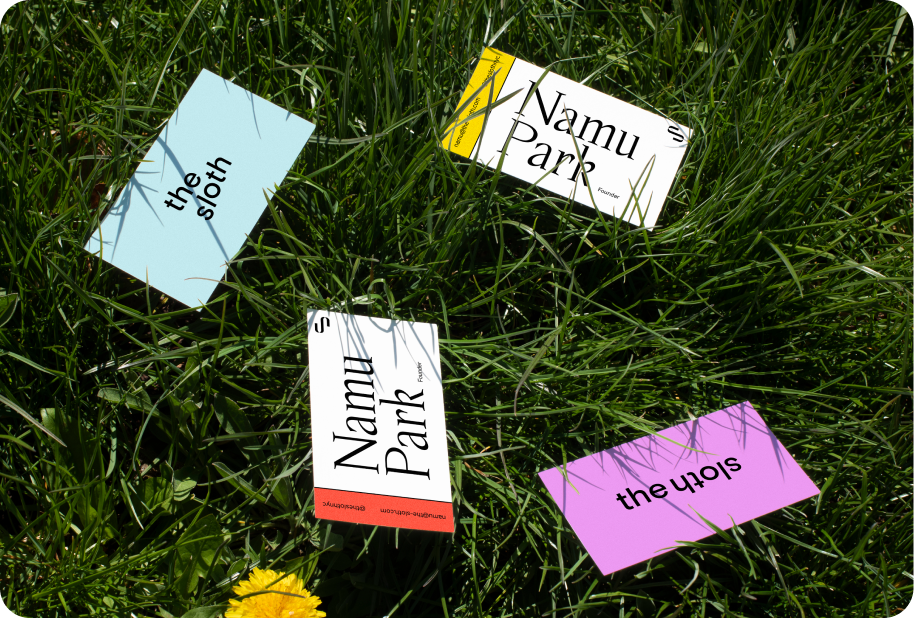
CREDITS
Portraiture work by Lee Jameson
Collateral photography by Studio HMVD
Typeface design in collaboration with Hunter Simpson
NOTABLE PRESS
the challenge
Be audacious. Take up space. Present photographer Lee Jameson as the definitive go-to for creative portraiture.
outer context
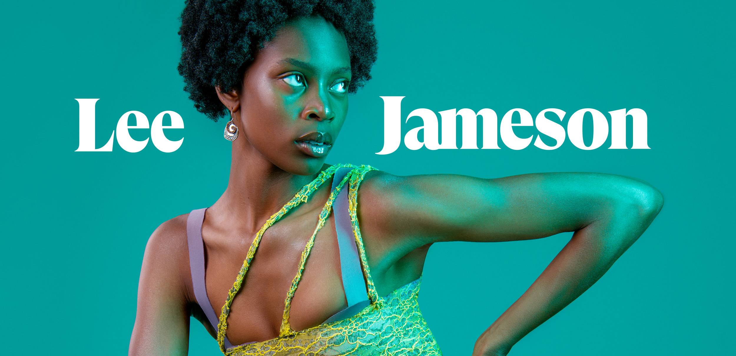
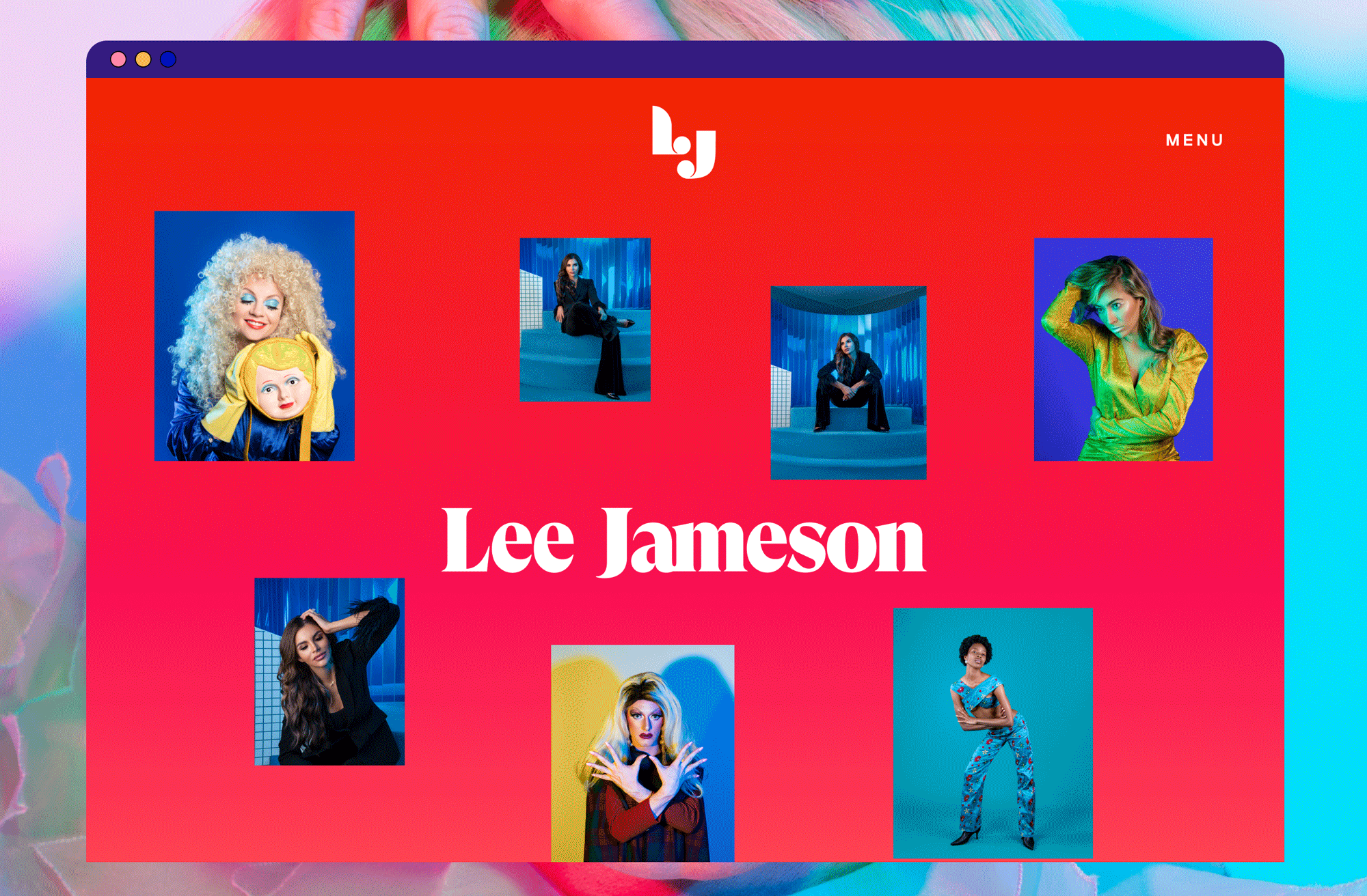
Posed to make moves in the photography world, Lee’s work springs from her subjects (often femme creatives, and phenoms in their own right), a background in film and a deeply held reverence for the female gaze. We drew from these values an identity that could stand up to, but not overshadow Lee’s vibrant body of images.
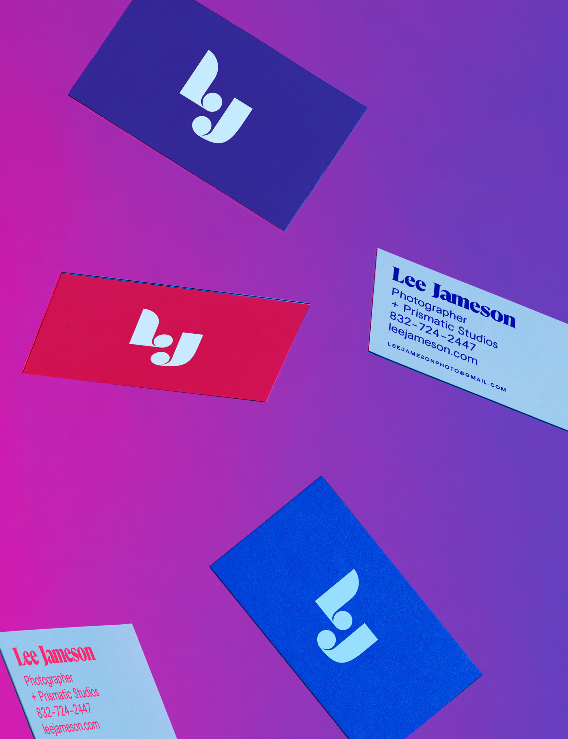
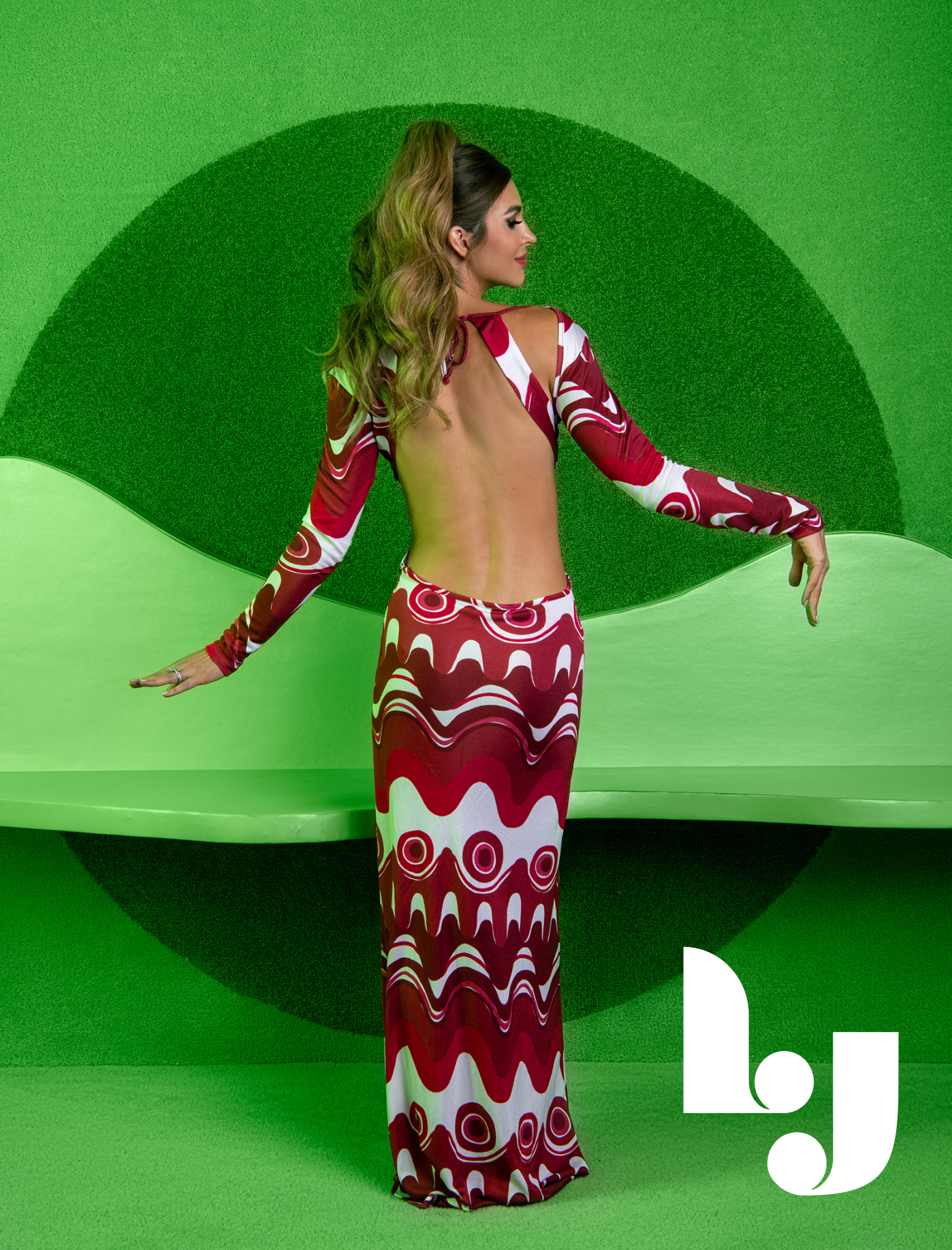
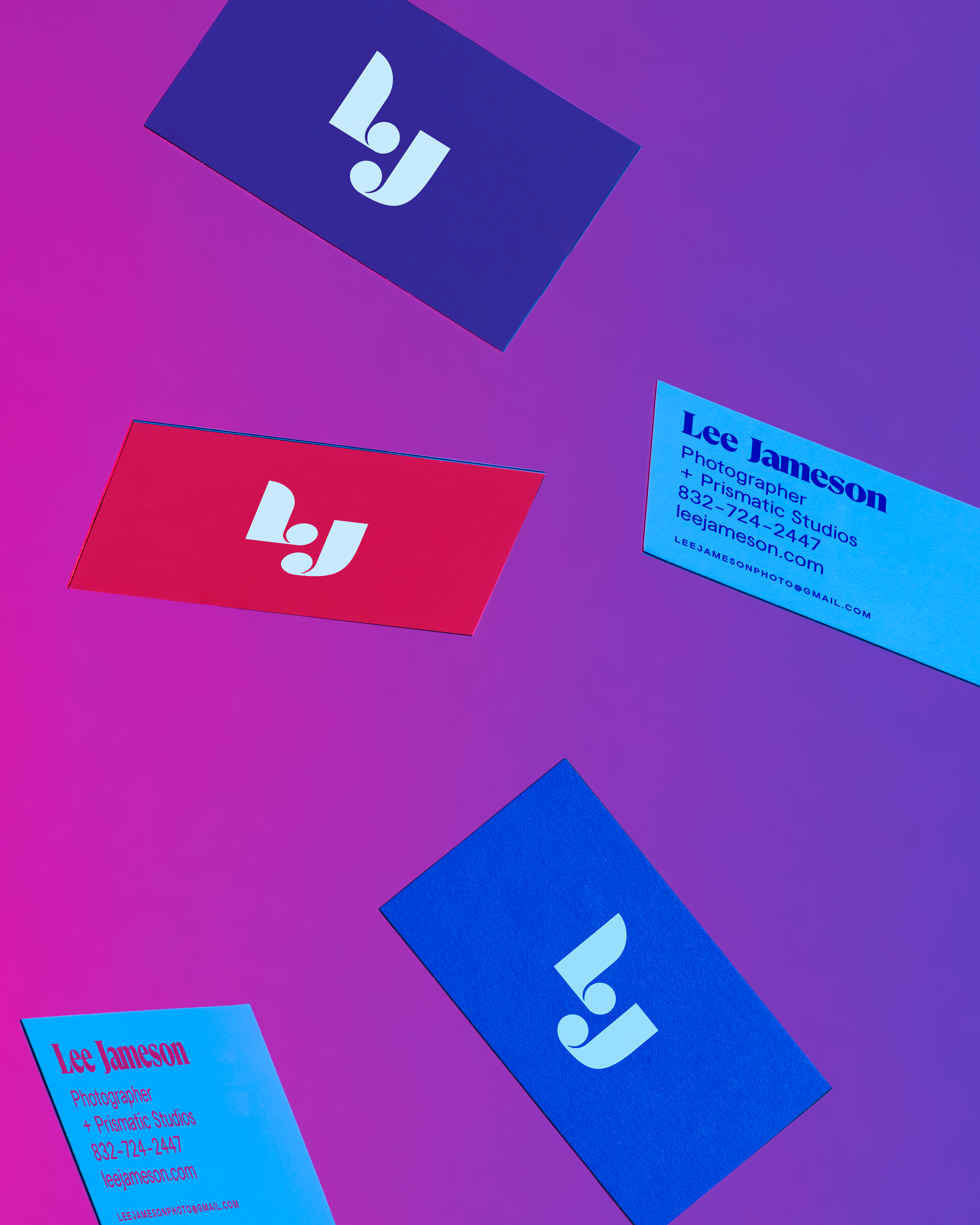
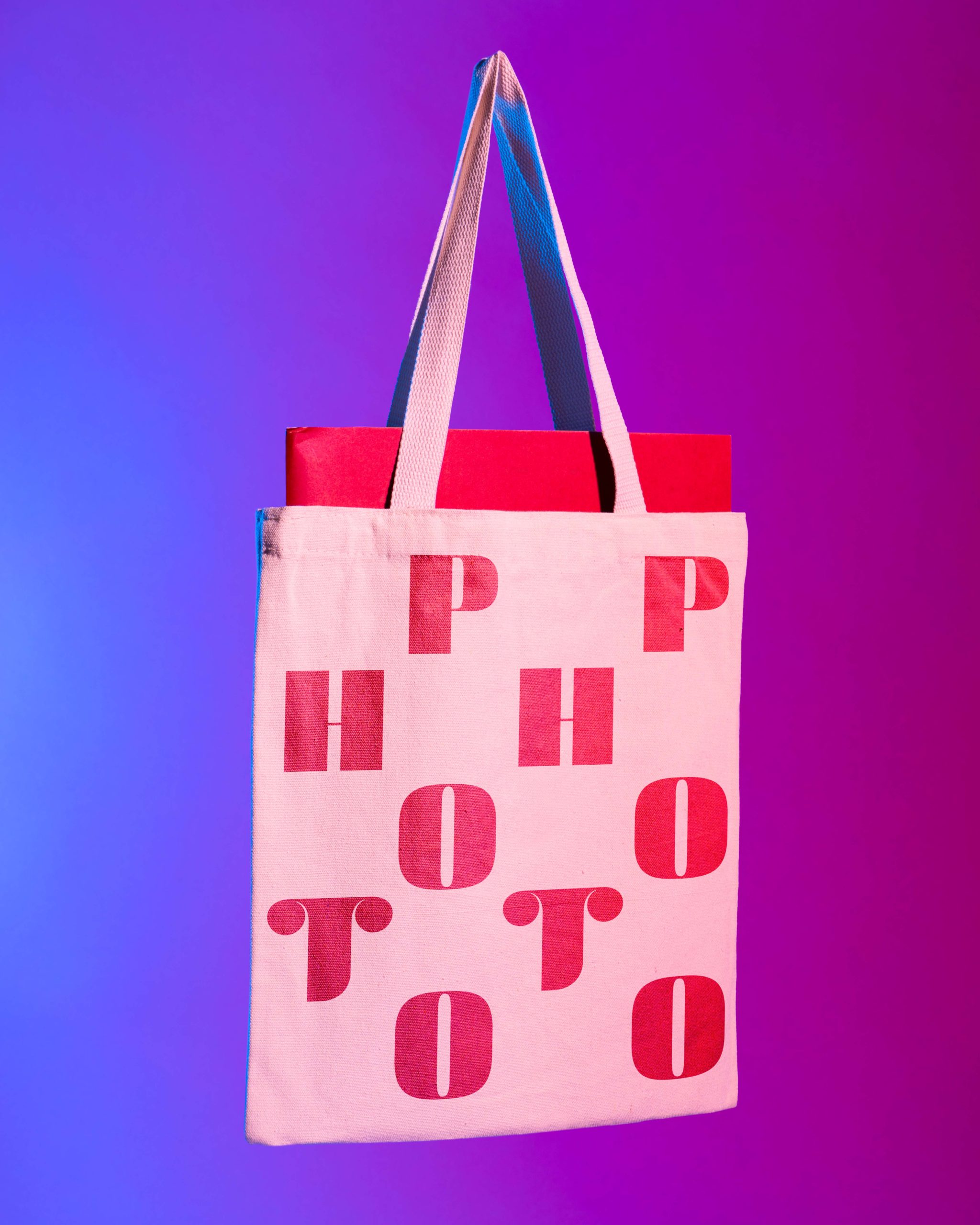
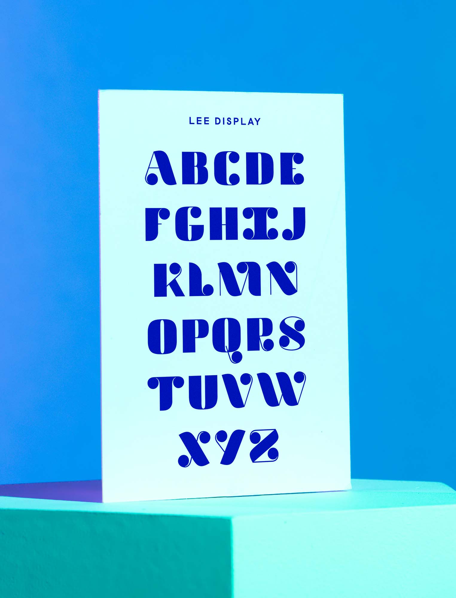
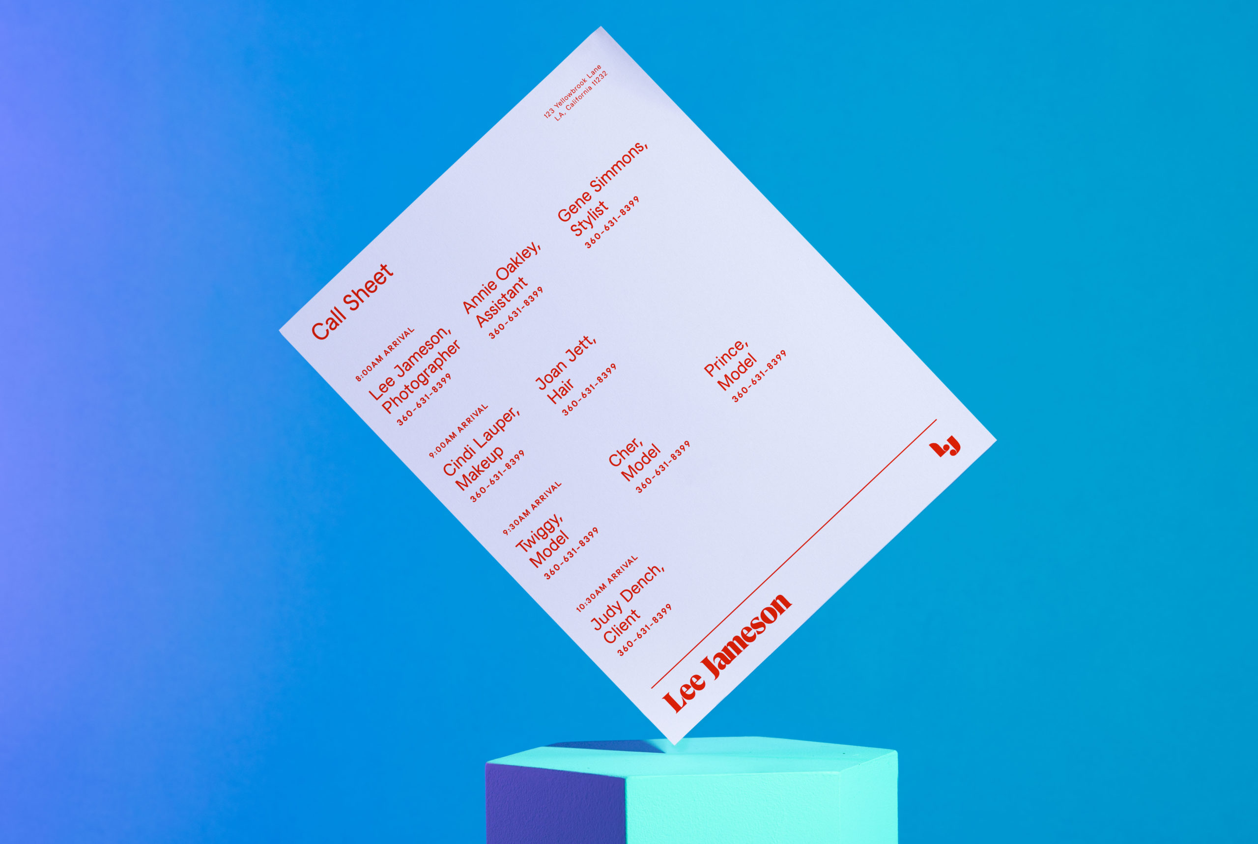
Lee’s brand identity emerged as an ultra curvy homage to glamor, the silver screen and 60s grid systems. A sharply typographic logo system has two important qualities— flexibility and character— with a modular logo and sumptuous mark. We assembled a utilitarian-flamboyant type system, with the cherry on top being a fully custom display typeface based off of the characters in the logomark. Swirling forms are underpinned by a functional layout grid, and rich colors compliment, rather than hide behind, Lee’s stunning work.
our move
The flair of Lee’s identity translated seamlessly into collateral, a saturated portfolio website and a comprehensive set of digital brand guidelines, so her identity can grow right alongside her practice.
the challenge
Be audacious. Take up space. Define photographer Lee Jameson as the definitive go-to for creative portraiture.
SERVICES PROVIDED
Brand strategy
Visual identity
Copywriting
Website Design
outer context
Posed to make moves in the photography world, Lee’s work springs from her subjects (often femme creatives, and phenoms in their own right), a background in film and a deeply held reverence for the female gaze. We drew from these values an identity that could stand up to, but not overshadow Lee’s vibrant body of images.
Lee’s brand identity emerged as an ultra curvy homage to glamor, the silver screen and 60s grid systems. A sharply typographic logo system has two important qualities— flexibility and character— with a modular logo and sumptuous mark. We assembled a utilitarian-flamboyant type system, with the cherry on top being a fully custom display typeface based off of the characters in the logomark. Swirling forms are underpinned by a functional layout grid, and rich colors compliment, rather than hide behind, Lee’s stunning work.
our move
The flair of Lee’s identity translated seamlessly into collateral, a saturated portfolio website and a comprehensive set of digital brand guidelines, so her identity can grow right alongside her practice.
CREDITS
Portraiture work by Lee Jameson
Collateral photography by Studio HMVD
Typeface design in collaboration with Hunter Simpson
CREDITS
SYSTEM
FOOTNOTES
Lee's logo system has flexibility & character— two important qualities for visual identities as well as life.


identity FOOTNOTES
We created a full display typeface based off our LJ mark— adding a daring bit of character to the utilitarian type system
IDENTITY
FOOTNOTES
Rather than hide from bold colors, we chose a palette that perfectly puncuated Lee's portraiture.
IN
SUMMATION
To put Lee on the right path, we assembled a robust set of digital brand guidelines, which she can continue to update & reference as her body of work grows.
SEND SALUTATIONS
NEWSLETTER