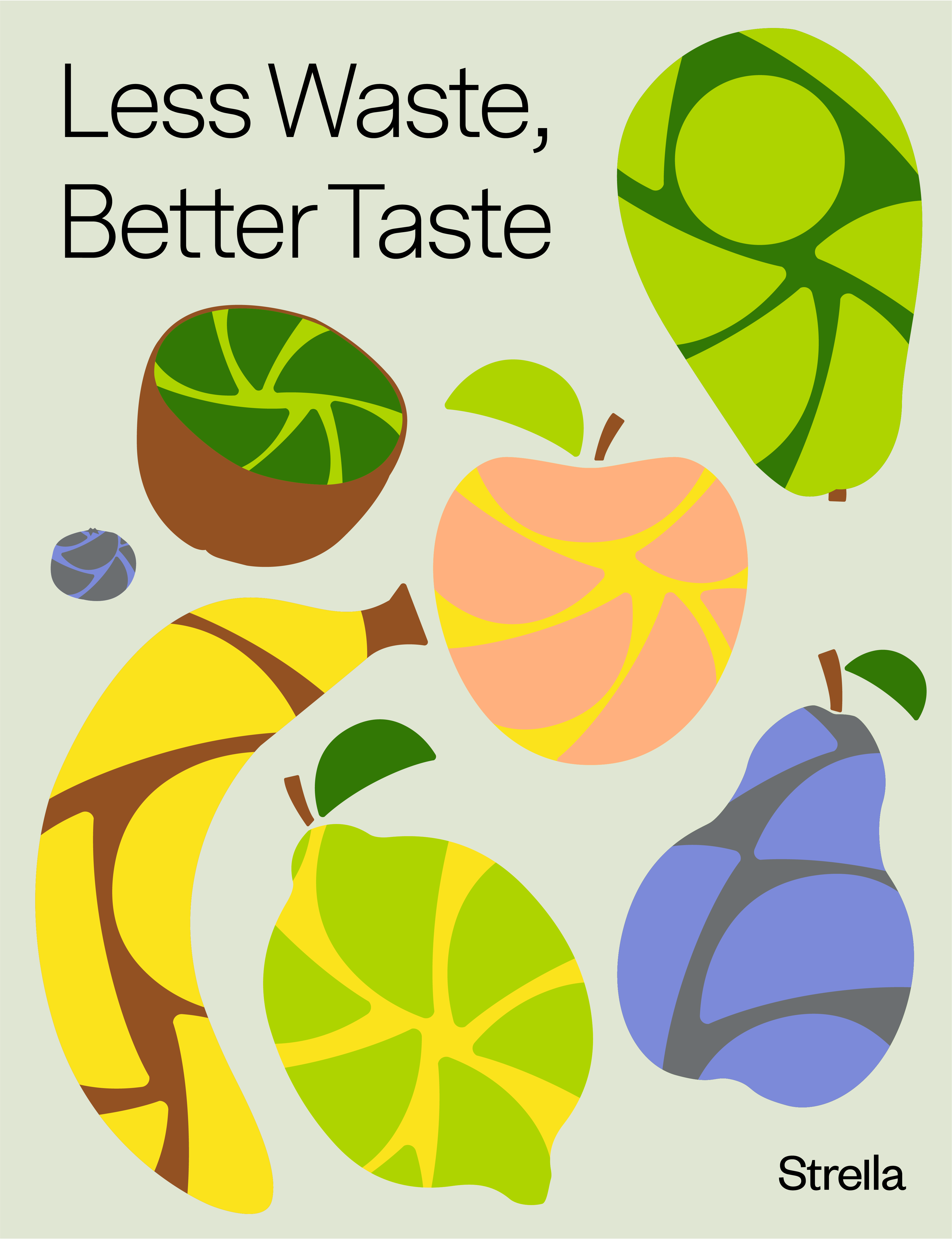
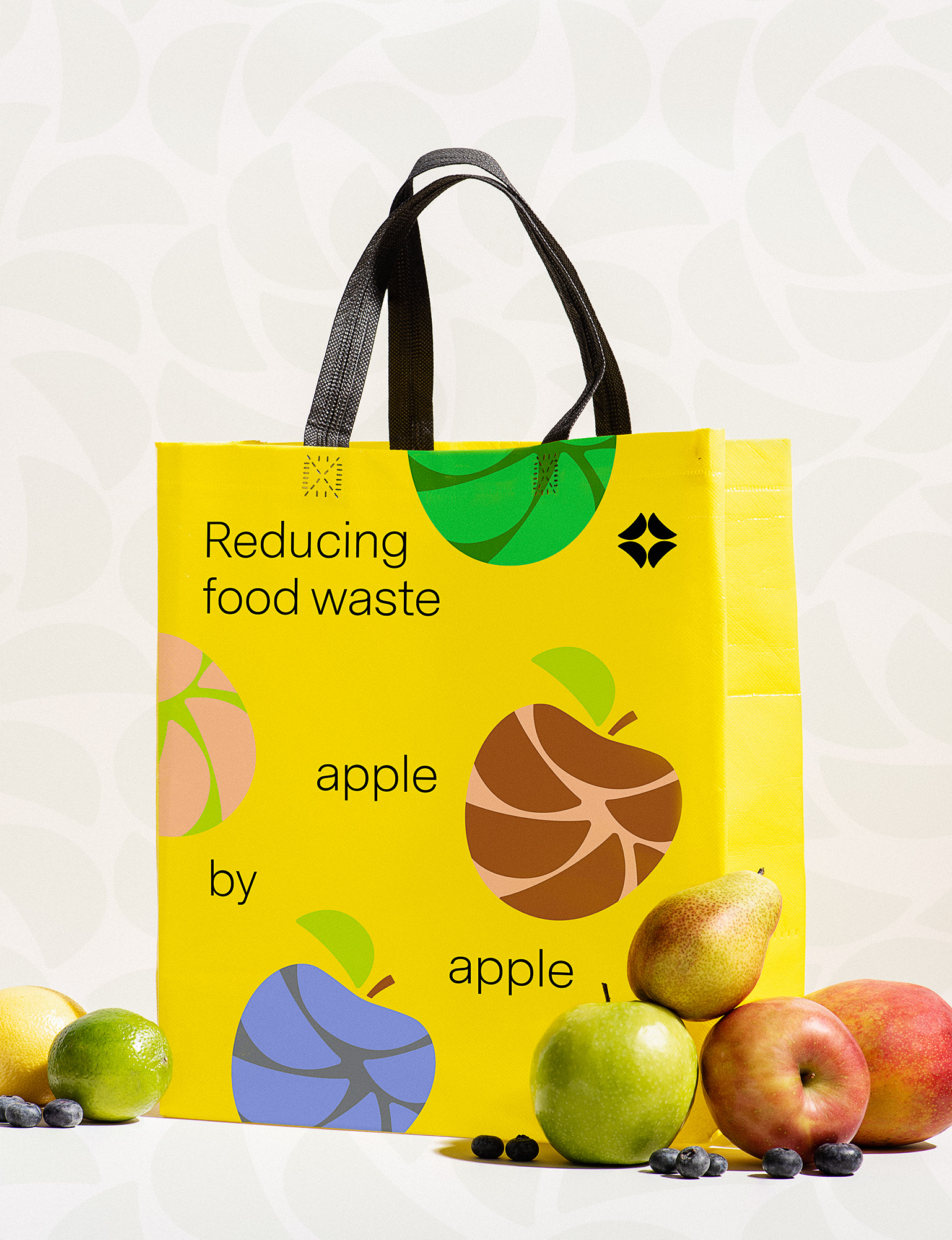
Reducing food waste fruit by fruit.
Never been fresher
Brand strategy, visual identity, website design, ui design, collateral design
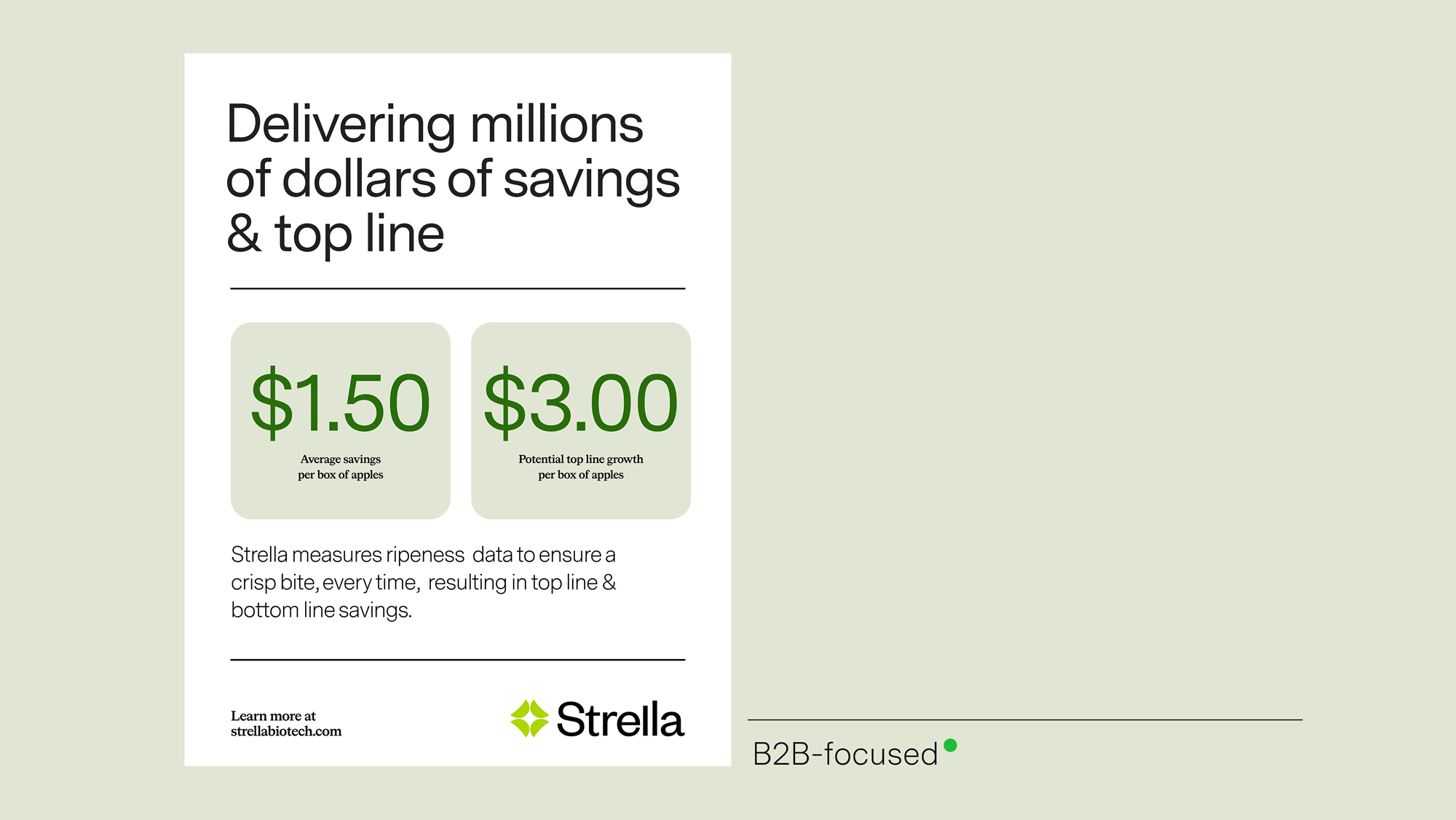
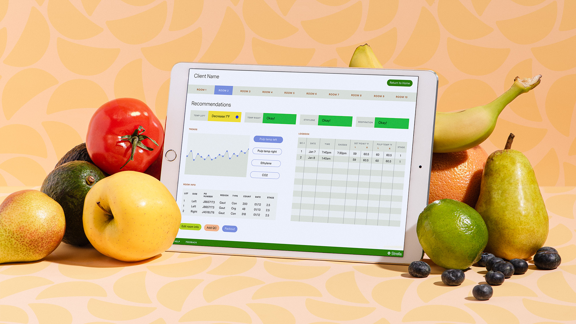
Ever bite into a mushy apple, or cut into an avocado only to be disappointed? Strella tackles the problems that arise with storing, shipping and selling produce, so that a better fruit makes its way down the line, and into your mouth.
We created a brand identity that made Strella synonymous with freshness, while appealing to produce industry execs, VCs and everyday fruit consumers.
STRATEGIC
INSIGHTS
Through our tried and true brand identity process, we arrived at a key insight:
Since the supply chain and Strella’s technology is complicated, let’s make things simple. From flat fruit-slice shapes, to a sans-serif typography palette, we opted for fresh and airy over techy and dark.

BRAND
CONSIDERATIONS
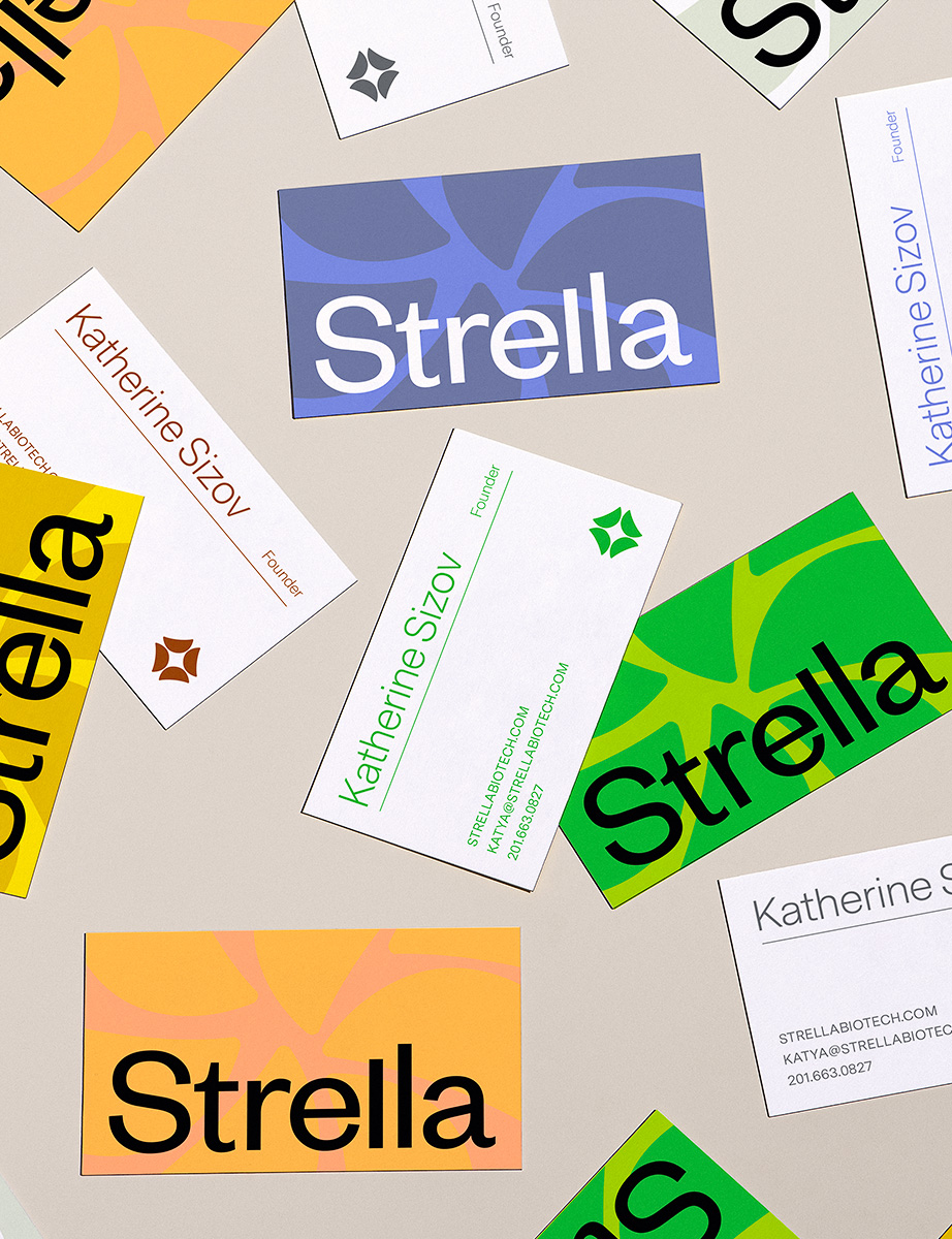
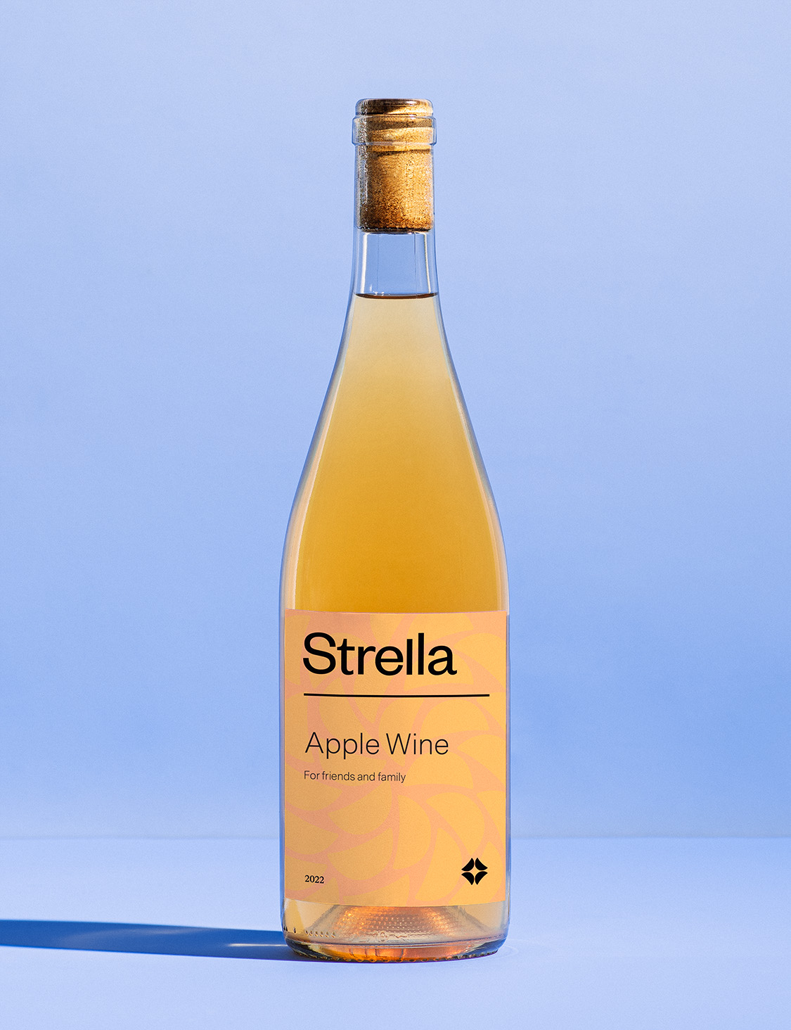
The visual identity can flex from minimal to maximal, depending on the audience.

total transformation
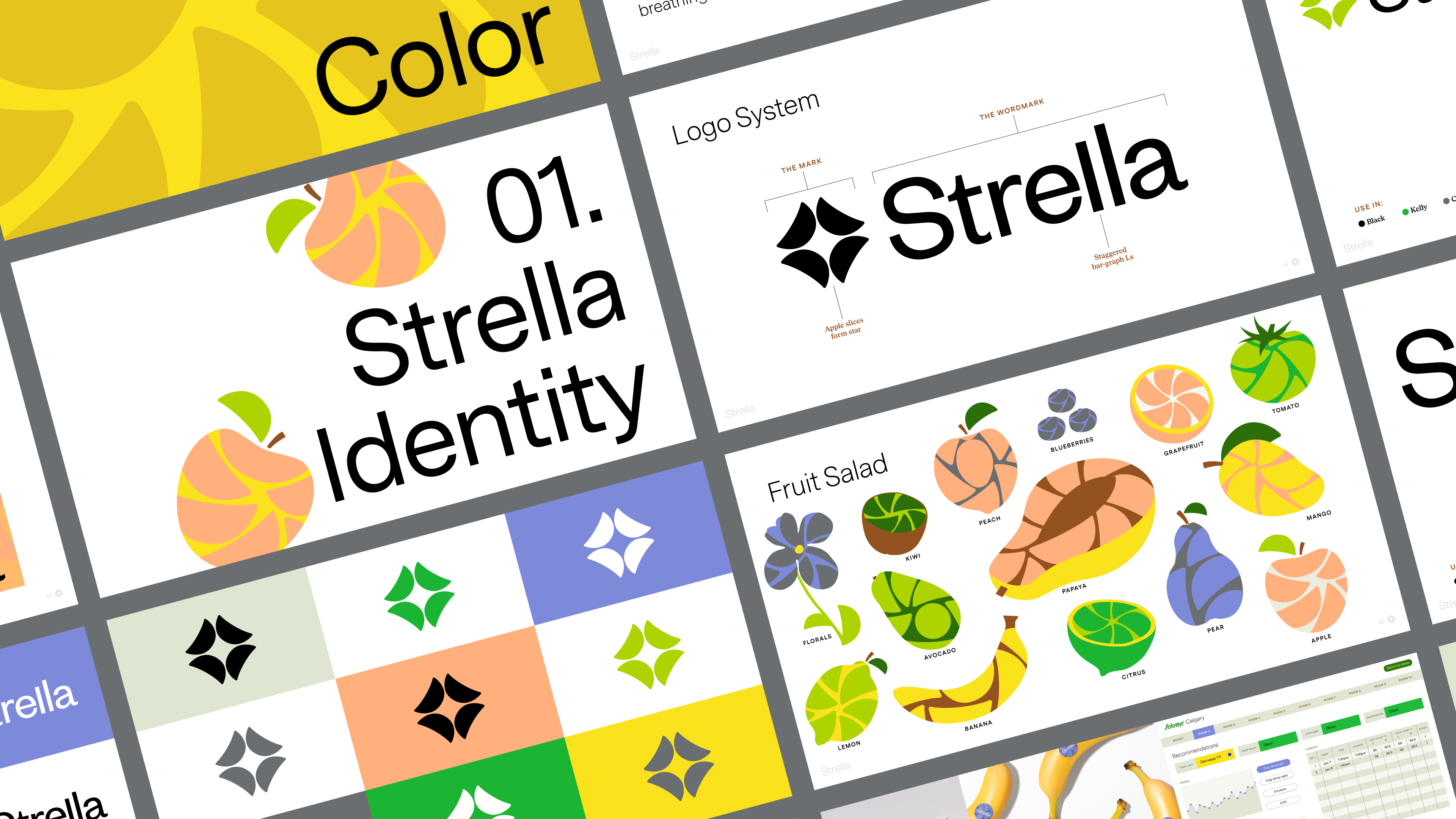
Strella is derived from the Russian word, Strelka, which means arrow and often alludes to future thinking, or reaching for the stars. We wanted to lean in to this innovation-driven feeling within the updated identity.
LOGO
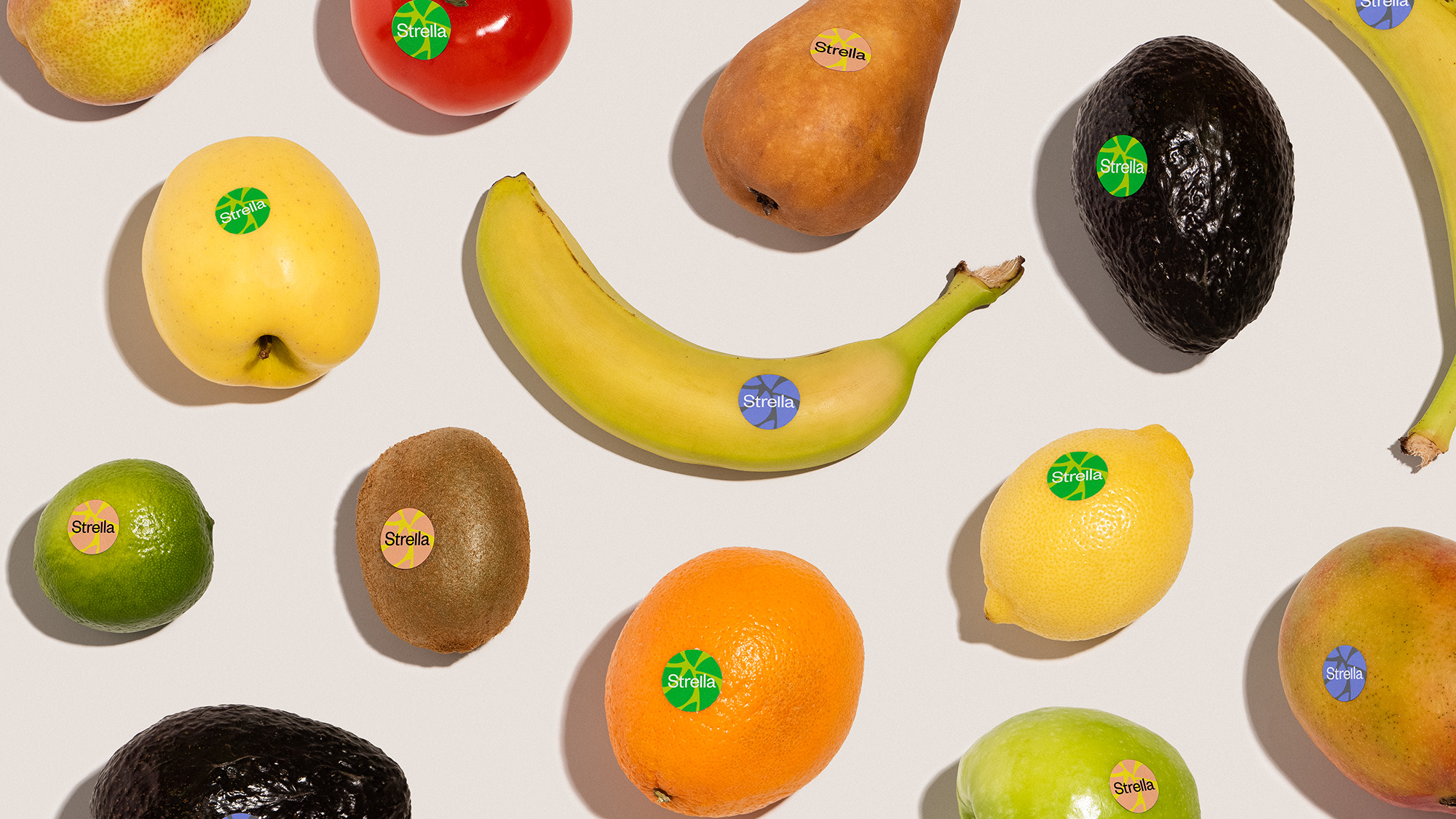
Our Strella star icon is made of 4 distinct "apple slices" which can break apart to create patterns and animations.
WORDMARK
The staggered Ls in our wordmark reference bar graphs and other data visualization used throughout Strella's day-to-day practices.
custom
website
We designed a story-driven website for Strella's ongoing marketing needs.

more work for tech-based startups
SEND SALUTATIONS
NEWSLETTER